通过CSS实现圆形动态加载条动画效果
在做前端的时候,常用到进度条显示的效果;长条形的进度条是最常见也是比较简单的,如果想独特一些,用圆形的进度条该怎么实现呢?可以用纯CSS实现吗?
当然可以的,下面便分享完整的制作过程。
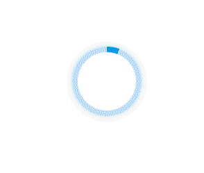
话不多说,先看最终效果图。

(最下方附成品效果源码文件)
逻辑分析
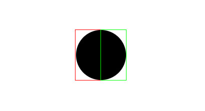
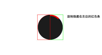
1、如何实现转动的效果呢?先分析一下逻辑,我们先画一个圆。

2、然后将圆分为左右两个。
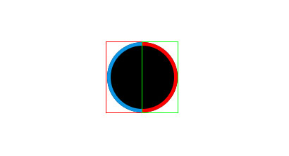
3、此时在左右两边中各放一个圆形条,为区分显示左边有蓝色显示,右边用红色显示,此时我们在左右两个框加一个限制,超出框的内容自动隐藏。
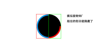
4、那么便可以实现旋转右边的红条,多余的部分会隐藏掉,同理可得旋转左边的蓝条多余的部分也可会隐藏。
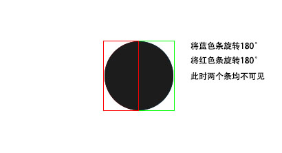
5、这样还不能实现我们要的色条逐渐出现的旋转动画,继续我们将左边的红条旋转180度,然后将右边的蓝色条也旋转180度,这样两个色条就全部被隐藏掉。
6、此时,开始对隐藏在左边的红色条进行旋转,配合动画,就可以实现进度条的效果啦~
理论存在,下面就开始实践。
完整代码
1、添加页面标签
<div class="circle">
<div class="circle-left">
<div class="circle-bar"></div>
</div>
<div class="circle-right">
<div class="circle-bar"></div>
</div>
</div>
2、css样式
.circle{
    position: relative;
    width: 100px;
    height: 100px;
    background:transparent;
    margin:0 auto;
    border-radius: 50%;
    box-shadow: 0px 0px 10px #beddff
}
.circle::after{
    position:absolute;
    width: 100%;
    height: 100%;
    content: '';
    box-sizing: border-box;
    border-radius: 50%;
    border: 8px solid #beddff;
}
.circle .circle-bar{
    position: absolute;
    top: 0px;
    width: 100%;
    height: 100%;
    box-sizing: border-box;
    border:8px solid #0c95e4;
}
.circle-left{
    position:absolute;
    z-index: 1;
    top: 0;
    left: 0;
    width: 50%;
    height: 100%;
    overflow: hidden;
}
.circle-left .circle-bar{
    left: 100%;
    border-top-right-radius: 50px;
    border-bottom-right-radius: 50px;
    border-left: none;
    transform-origin: center left;
    animation: loading-left 1s linear forwards 1.5s;
}
.circle-right{
    position:absolute;
    z-index: 1;
    top: 0;
    right: 0;
    width: 50%;
    height: 100%;
    overflow: hidden;
}
.circle-right .circle-bar{
    left: -100%;
    border-top-left-radius: 50px;
    border-bottom-left-radius: 50px;
    border-right: none;
    transform-origin: center right;
    animation: loading-right 1.5s linear forwards;
}
/* 动画样式 */
@keyframes loading-right{
    0%{
        transform: rotate(0deg);
    }
    100%{
        transform: rotate(180deg);
    }
}
@keyframes loading-left{
    0%{
        transform: rotate(0deg);
    }
    100%{
        transform: rotate(80deg);
    }
}
O克,成功实现圆形进度条的效果
源码正在打包上传中...
本文由:小天丶 发布于 小菜的IT网,转载请注明出处:https://www.xiaocaiit.cn/267.html
 小天丶
小天丶 


评论此文章
已有1人参与了评论不错